|
|
||
|---|---|---|
| .. | ||
| icons | ||
| screenshots | ||
| widgets | ||
| README.md | ||
| utils.lua | ||
| volume-2.svg | ||
| volume.lua | ||
README.md
Volume widget
Volume widget based on amixer (is used for controlling the audio volume) and pacmd (is used for selecting a sink/source). Also, the widget provides an easy way to customize how it looks, following types are supported out-of-the-box:
From left to right: horizontal_bar, vertical_bar, icon, icon_and_text, arc
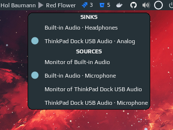
A right-click on the widget opens a popup where you can choose a sink/source:

Features
- switch between sinks/sources by right clicking on the widget;
- more responsive than previous versions of volume widget, which were refreshed once a second;
- 5 predefined customizable looks;
Installation
Clone the repo under ~/.config/awesome/ and add widget in rc.lua:
local volume_widget = require('awesome-wm-widgets.experiments.volume.volume')
...
s.mytasklist, -- Middle widget
	{ -- Right widgets
    	layout = wibox.layout.fixed.horizontal,
        ...
        -- default
        volume_widget(),
        -- customized
        volume_widget{
            type = 'arc'
        },
Shortcuts
To improve responsiveness of the widget when volume level is changed by a shortcut use corresponding methods of the widget:
awful.key({ modkey }, "]", function() volume_widget:inc() end),
awful.key({ modkey }, "[", function() volume_widget:dec() end),
awful.key({ modkey }, "\\", function() volume_widget:toggle() end),
Customization
It is possible to customize the widget by providing a table with all or some of the following config parameters:
Generic parameter
| Name | Default | Description |
|---|---|---|
type |
icon_and_text |
Widget type, one of horizontal_bar, vertical_bar, icon, icon_and_text, arc |
Depending on the chosen widget type add parameters from the corresponding section below:
icon parameters
| Name | Default | Description |
|---|---|---|
icon_dir |
./icons |
Path to the folder with icons |
Note: if you are changing icons, the folder should contain following .svg images:
- audio-volume-high-symbolic
- audio-volume-medium-symbolic
- audio-volume-low-symbolic
- audio-volume-muted-symbolic
icon_and_text parameters
| Name | Default | Description |
|---|---|---|
icon_dir |
./icons |
Path to the folder with icons |
font |
beautiful.font |
Font name and size, like Play 12 |
arc parameters
| Name | Default | Description |
|---|---|---|
thickness |
2 | Thickness of the arc |
main_color |
beautiful.fg_color |
Color of the arc |
bg_color |
#ffffff11 |
Color of the arc's background |
mute_color |
beautiful.fg_urgent |
Color of the arc when mute |
size |
18 | Size of the widget |
horizontal_bar parameters
| Name | Default | Description |
|---|---|---|
main_color |
beautiful.fg_normal |
Color of the bar |
mute_color |
beautiful.fg_urgent |
Color of the bar when mute |
bg_color |
'#ffffff11' |
Color of the bar's background |
width |
50 |
The bar width |
margins |
10 |
Top and bottom margins (if your wibar is 22 px high, bar will be 2 px = 22 - 2*10) |
shape |
'bar' |
gears.shape, could be octogon, hexagon, powerline, etc |
with_icon |
true |
Show volume icon |
Note: I didn't figure out how does the forced_height property of progressbar widget work (maybe it doesn't work at all), thus there is a workaround with margins.
vertical_bar parameters
| Name | Default | Description |
|---|---|---|
main_color |
beautiful.fg_normal |
Color of the bar |
mute_color |
beautiful.fg_urgent |
Color of the bar when mute |
bg_color |
'#ffffff11' |
Color of the bar's background |
width |
10 |
The bar width |
margins |
20 |
Top and bottom margins (if your wibar is 22 px high, bar will be 2 px = 22 - 2*10) |
shape |
'bar' |
gears.shape, could be octogon, hexagon, powerline, etc |
with_icon |
true |
Show volume icon |
