2021-07-15 00:22:15 +02:00
## 🔍 Task Preview <!-- {docsify-ignore} -->
2021-07-15 00:17:46 +02:00
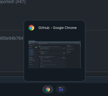
This is a popup widget that will show a preview of the specified client. It is supposed to mimic the small popup that Windows has when hovering over the application icon.

*image by [javacafe ](https://github.com/JavaCafe01 )*
### Usage
To enable:
```lua
2021-07-20 22:34:43 +02:00
bling.widget.task_preview.enable {
2021-10-13 17:26:04 +02:00
x = 20, -- The x-coord of the popup
y = 20, -- The y-coord of the popup
height = 200, -- The height of the popup
width = 200, -- The width of the popup
placement_fn = function(c) -- Place the widget using awful.placement (this overrides x & y)
2021-07-15 00:17:46 +02:00
awful.placement.bottom(c, {
margins = {
bottom = 30
}
2021-10-13 17:26:04 +02:00
})
2021-08-11 22:55:41 +02:00
end
2021-10-13 17:26:04 +02:00
}
2021-08-11 22:55:41 +02:00
```
To allow for more customization, there is also a `widget_structure` property (as seen in some default awesome widgets) which is optional. An example is as follows -
```lua
bling.widget.task_preview.enable {
2021-10-13 17:26:04 +02:00
x = 20, -- The x-coord of the popup
y = 20, -- The y-coord of the popup
height = 200, -- The height of the popup
width = 200, -- The width of the popup
placement_fn = function(c) -- Place the widget using awful.placement (this overrides x & y)
2021-08-11 22:55:41 +02:00
awful.placement.bottom(c, {
margins = {
bottom = 30
}
2021-10-13 17:26:04 +02:00
})
2021-08-11 22:55:41 +02:00
end,
-- Your widget will automatically conform to the given size due to a constraint container.
widget_structure = {
{
{
{
2021-10-13 17:26:04 +02:00
id = 'icon_role',
2021-08-11 22:55:41 +02:00
widget = awful.widget.clienticon, -- The client icon
},
{
2021-10-11 14:17:58 +02:00
id = 'name_role', -- The client name / title
2021-08-11 22:55:41 +02:00
widget = wibox.widget.textbox,
2021-10-11 14:17:58 +02:00
},
2021-08-11 22:55:41 +02:00
layout = wibox.layout.flex.horizontal
},
widget = wibox.container.margin,
margins = 5
},
{
id = 'image_role', -- The client preview
resize = true,
valign = 'center',
2022-03-13 10:49:36 +01:00
halign = 'center',
2021-08-11 22:55:41 +02:00
widget = wibox.widget.imagebox,
},
layout = wibox.layout.fixed.vertical
}
2021-10-13 17:26:04 +02:00
}
2021-07-15 00:17:46 +02:00
```
Here are the signals available:
```lua
-- bling::task_preview::visibility -- first line is the signal
2021-10-13 17:26:04 +02:00
-- s (screen) -- indented lines are function parameters
-- v (boolean)
-- c (client)
2021-07-15 00:17:46 +02:00
```
By default, the widget is not visible. You must implement when it will update and when it will show.
### Example Implementation
We can trigger the widget to show the specific client when hovering over it in the tasklist. The code shown below is the example icon only tasklist from the [AwesomeWM docs ](https://awesomewm.org/doc/api/classes/awful.widget.tasklist.html ). Basically, we are going to toggle the widget through the tasklist's `create_callback` . (The bling addons are commented)
```lua
s.mytasklist = awful.widget.tasklist {
screen = s,
filter = awful.widget.tasklist.filter.currenttags,
buttons = tasklist_buttons,
layout = {
spacing_widget = {
{
forced_width = 5,
forced_height = 24,
thickness = 1,
color = '#777777',
widget = wibox.widget.separator
},
valign = 'center',
halign = 'center',
widget = wibox.container.place,
},
spacing = 1,
layout = wibox.layout.fixed.horizontal
},
-- Notice that there is *NO* wibox.wibox prefix, it is a template,
-- not a widget instance.
widget_template = {
{
wibox.widget.base.make_widget(),
forced_height = 5,
id = 'background_role',
widget = wibox.container.background,
},
{
{
id = 'clienticon',
widget = awful.widget.clienticon,
},
margins = 5,
widget = wibox.container.margin
},
nil,
create_callback = function(self, c, index, objects) --luacheck: no unused args
self:get_children_by_id('clienticon')[1].client = c
2021-10-13 17:26:04 +02:00
2021-07-15 00:17:46 +02:00
-- BLING: Toggle the popup on hover and disable it off hover
self:connect_signal('mouse::enter', function()
awesome.emit_signal("bling::task_preview::visibility", s,
true, c)
end)
self:connect_signal('mouse::leave', function()
awesome.emit_signal("bling::task_preview::visibility", s,
false, c)
end)
end,
layout = wibox.layout.align.vertical,
},
}
```
### Theme Variables
```lua
2021-10-13 17:26:04 +02:00
theme.task_preview_widget_border_radius = 0 -- Border radius of the widget (With AA)
theme.task_preview_widget_bg = "#000000" -- The bg color of the widget
theme.task_preview_widget_border_color = "#ffffff" -- The border color of the widget
theme.task_preview_widget_border_width = 3 -- The border width of the widget
theme.task_preview_widget_margin = 0 -- The margin of the widget
2021-07-15 00:17:46 +02:00
```
NOTE: I recommend to only use the widget border radius theme variable when not using shadows with a compositor, as anti-aliased rounding with the outer widgets made with AwesomeWM rely on the actual bg being transparent. If you want rounding with shadows on the widget, use a compositor like [jonaburg's fork ](https://github.com/jonaburg/picom ).